Gifter
00

Reimagining Gifting with Sri Lanka's First Gift Card Platform
Gifter is Sri Lanka's first common gift voucher platform that solves a persistent problem: the anxiety of choosing the "perfect" gift. By partnering with merchants nationwide, Gifter allows users to purchase gift cards of any value that recipients can redeem both online and in-store at their preferred locations.
Discovery: When a Redesign Revealed Deeper UX Issues
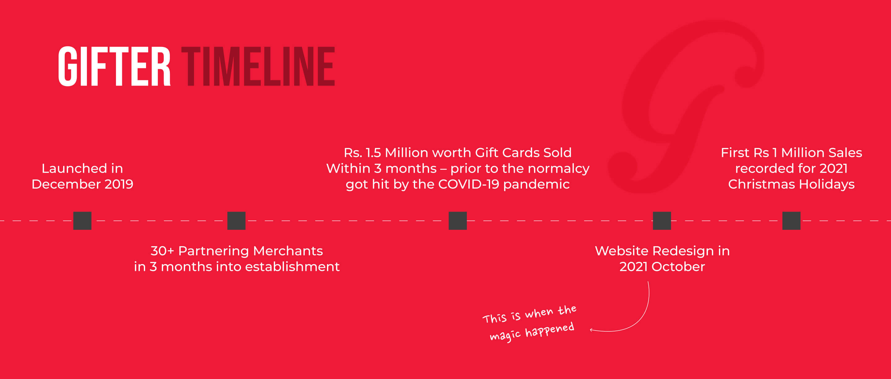
Gifter had been operating since 2019 with the website as its primary customer touchpoint. In 2021, stakeholders requested a redesign following a brand refresh. With established brand guidelines in hand, the project seemed straightforward update the visual design to align with the new identity.
However, during my preliminary user research and journey mapping exercise, I uncovered a critical usability issue that had been hiding in plain sight: while thousands of customers successfully purchased gift cards online, the redemption experience at physical merchant locations was fundamentally broken. Despite decent sales, users were abandoning the product at the most crucial moment when recipients tried to actually use their gifts. This discovery shifted the entire project from a cosmetic redesign to a comprehensive UX overhaul addressing the complete end-to-end experience.
industry
Ecommerce
timeframe
4 Weeks
tools
Figma, Photoshop, Illustrator
category
UI/UX
01

Data analysis revealed that most purchasers were corporate clients using Gifter for employee gifts.
Redesigning an e-commerce experience where the real problem wasn't the website— it was what happened after purchase
02

While the website successfully facilitated thousands of purchases, the in-store redemption experience was severely broken.
Research: Working Within Constraints
With limited research budget and a hard December deadline, I conducted targeted stakeholder interviews with partner merchants and customers who had reported issues. This lean research approach quickly surfaced the core problem: a hidden activation step that users didn't know existed. The intended journey was:
Purchase gift card online
Receive physical card
Activate card on Gifter website (the invisible step)
Redeem at merchant locations
Recipients skipped step 3 entirely because nothing indicated it was necessary. They'd arrive at stores expecting to use their gift immediately, only to have cards rejected at checkout. The frustration was so severe that merchants were calling Gifter's support hotline at midnight to manually activate cards for disappointed customers.
Impact: This single missing touchpoint was creating friction across the entire ecosystem eroding customer trust, overwhelming support staff, and damaging merchant relationships.
03

Redesign Gifter's user journey to reveal and fix a critical activation step that was invisible to users, costing the business customer trust and merchant relationships.
impact
This single missing touchpoint was creating friction across the entire ecosystem eroding customer trust, overwhelming support staff, and damaging merchant relationships.
idea
The gifter (purchaser) didn't need redemption instructions they weren't the one redeeming the card. Overloading them with information about activation steps would only create confusion and diminish the joy of giving.
Solution: Meeting Users Where They Are
The fix required reframing our mental model of who needed what information, and when. So, I proposed embedding instructions directly with the physical gift card itself a printed insert explaining the simple activation process. This approach followed core usability principles: provide help exactly when and where users need it, and design for error prevention rather than error recovery.
The redesigned journey:
Purchaser buys card with a streamlined, distraction free checkout
Recipient receives card with clear, visual activation instructions
Recipient visits Gifter.com to activate (now an expected, understood step)
Recipient redeems confidently at any merchant
This solution had a secondary benefit: it created a second touchpoint with recipients, introducing them to the Gifter platform and potentially converting them into future purchasers.
+

Results: From Pain Point to Success Story
The solution proved its value immediately. The redesigned experience launched in time for the 2021 holiday season and Gifter hit its first million-rupee sales milestone but more importantly, the redemption experience finally worked as intended. The impact was measurable across multiple dimensions:
Business Metrics:
Gifter achieved its first million-rupee sales milestone during the Christmas period
Support call volume related to activation issues dropped significantly (lack of data to quantify)
Merchant complaints regarding failed redemptions decreased significantly
User Experience Metrics:
Eliminated the activation failure point that had plagued the platform since launch
Created a seamless, intuitive journey from purchase to redemption
Improved recipient confidence and satisfaction during in-store redemption
key metrics
User data revealed that 68% of purchases came from B2B corporate gifting. This discovery informed Gifter's 2022 product roadmap, leading to the development of dedicated corporate features and bulk purchasing capabilities.
key learnings
This project reinforced a core UX principle: sometimes the biggest problems aren't on the screen they're in the gaps between touchpoints. By expanding my view beyond the website to encompass the entire user journey, I was able to identify and solve a critical issue that had been invisible to the business.

